

6 Simple Tips for Effective Landing Page Design
At Lilac James we are marketers who specialise in SEO, Google Ads & Social Media Marketing, but regardless of how good we are and how much highly relevant and qualified traffic we drive to a webpage, customers will always bounce if they’re landing on a poorly designed page.
An effective landing page is a powerful tool in your online marketing and must be given full and proper consideration.
Your job isn’t done when you’ve created a fantastic marketing funnel which is driving lots of qualified traffic through multiple streams. That’s just the start of building an effective marketing and sales flow.
Having a poor landing page is like putting a marble at the bottom of your funnel, you must simply get this right. Luckily, it’s not too complex and here we’ll share our top 6 tips for effective landing page design.
What is a landing page?
For those who aren’t quite sure…
A landing page is a standalone page hosted on your website which is created for a specific offer, product or campaign.
For example, if you were to run an end of funnel re-marketing campaign offering a time limited 15% discount offer, you would create a specific ‘landing page’ that your marketing efforts would drive website traffic towards.
When the lead lands on the page, they’re landing on a page highly specific to what they’re looking for.
Sometimes these landing pages can be found through the main navigation bar but often, because they’re for time limited campaigns, they’re hosted in the backend of the website and you can only navigate to them by directly entering the URL or through the marketing campaign.
What can a landing page be used for?
They can be used for anything but generally:
1. To promote an event
2. To promote a specific product or service
3. To promote an offer or deal
4. To advertise and collect registrations for webinars
5. To collect email addresses for a lead generator
You can of course simply drive people to a regular product/service page but the same tips and principles I’m about to share remain highly relevant.
6 tips to design the best landing page
1. Have a single and clearly identified goal for the landing page
Sounds simple right? But it’s at the top of the list for a reason, so many get this wrong.
Ask yourself, what do you want the landing page to achieve? Do you want phone calls? Enquiry form submissions? Direct sales? Brochure downloads? Event bookings? etc…
Ideally, you want to design your landing page around this one single goal, there is an old saying, ‘a confused mind never buys’ so you need to keep your landing page simple and designed entirely around this one objective.
2. Write compelling copy
Again, not rocket science but there is a simple structure you can follow to really get this right. Before you write a word, really consider who your audience is, if you’re selling a technical solution to a non-technical audience, you’re going to have to use plain language, if you’re selling microscopes to scientists, you can use the language they’re comfortable using.
Remember with copy that each line is selling the desire of the reader to read the next one.
A general structure is:
Headline: Write a compelling headline that grabs attention.
Body: Keep it simple and informative. You must clearly and succinctly explain the benefits to the consumer of the action you wish them to take. This is not a time to write lots of content talking about product features, you can link out to that content if you wish.
Call to Action: You have to include a clear and simple CTA. If your CTA isn’t easy for the website visitor, they’re not going to do it, it really is that simple.
See the below great landing page example from Mail Chimp:
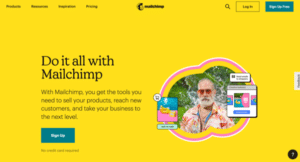
It’s simple, has a great headline, short body of text clearly explaining the benefits and an easy and obvious CTA ‘Sign Up’.
3. Ensure your Call to Action is above the fold
‘Above the Fold’ is what is displayed on a desktop, mobile or tablet BEFORE the page visitor has to scroll. It is imperative that the CTA is above the fold.
You don’t want the page visitor having to do anything other than complete the clearly defined objective you’ve set, the further they have to scroll, the more they will struggle to complete the action you desire, the more likely it is you won’t meet page objectives.
4. Further information including social proof below the fold
Further detail can then be included below the fold. If the page visitor decides they’re interested but not ready to commit to your CTA they may seek further information and to find that they’ll likely scroll.
So below the fold include any further information they may be seeking but ensure you include some social proof, information from others who have purchased your products or services, or attended your events that highlights and reinforces the benefits you’ve already clearly communicated.
5. Conduct A/B Testing
You never really know what is going to work best for your particular campaign, you will use your professional judgement and experience to take an educated guess, what professionals do is conduct an A/B test.
A landing page A/B test is when you create more than one landing page, testing different designs and calls to action, you then drive traffic to each page with your marketing efforts and measure the outcomes. Once you have identified the landing page which is converting best, you can stop using the others and funnel all traffic to your best performing design.
6. Clearly communicate authentic scarcity
The scarcity principle is well understood in marketing but it HAS to be authentic or your audience will rightly feel cheated. Don’t tell your audience there is only 10 spaces if there is 50.
A client of ours runs a yearly discount in March. This is because they’re keen to sell the remaining stock before their new financial year starts in April, so it suits them, and their customers, to run a short time discount to boost sales towards the end of their financial year.
If you do have limited supply, or any time restrictions etc, clearly communicate this scarcity on the landing page.
Click Funnels understand this well and have countdown timers and such like to encourage people to take action. Ticketmaster do it when you attempt to purchase tickets for events likely to sell out, you’ll see ‘you have 10 minutes to complete your purchase’. It focuses the mind and without doubt boosts their conversions.
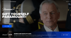
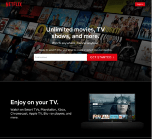
Here are some great examples to assist you:
Paramount Pictures:
Netflix:
Branch Furniture:
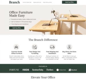
You will see in each landing page about the 6 key points clearly on display.
We hope this was of use to those reading, if you wish for any advice on landing pages or the marketing required to drive traffic towards them, please reach out to me via email at jamie@lilacjames.com or via our contact page.
If you would like to see more of Lilac James digital marketing blogs please click here.